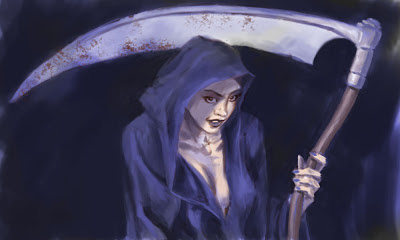
Well, I continue to play with Photoshop, and I think my skills are improving, to the point, gentle reader, that I am aboutto inflict a step-by-step on you...
This began as an unfocused doodle. At some point it implied the image of a skull, which morphed into, surprise, surprise, the personification of Death. But the tried and true left me a bit cool, so I thought, what if Death took an apprentice, a young woman, perhaps. Would she be angry, vengeful, goofy, mischievous, or just a little unsettling...?
My approach to painting in Ps has been a bit all over the map, so far. I've settled down a bit and decided to go with the grayscale-to-colour approach, really work on the value structure first, and then introduce colour. It worked for the Old Masters, and who am I to argue with long-lived success? I copied the drawing onto a new Multiply layer, so I could see through it, and began painting my values under it onto the Background layer.At this stage, I'm most concerned about simple blocks of only a few values. Mostly, I'm using a chalk brush, with Shape Dynamics off and Opacity set to Pen Pressure.
Following one of the great guiding principles, "work from the large, broad and general to the more refined and specific" I start to define the image a little more clearly. I refine the shape of the body and the hood of the cloak, and begin to paint the suggestions of volume, seperating the darks and lights. I've turned off the upper drawing layer now, so the bits of drawing you still see are from the original background image. Then I creat a new Overlay layer and wash in the first colour notes.
Now I have some base colour to work with, and I can continue to refine the shapes,volumes and edges. For the most part I will use the colour picker and adjust for saturation and value, in an attempt to keep the colour harmony intact. I don't actually introduce any new colour until I add the the rust (or perhaps dried bodily fluids) to blade of the scythe, with a textured brush.
A few more tweaks and fiddles and I think it's enough. It's still a long way from a finished illustration, but this was meant to be a learning exercise, and I think I've learned a lot. The face is still very much a coloured drawing as opposed to a painting, but I'll work on that in my next project.


No comments:
Post a Comment