

Showing posts with label comics. Show all posts
Showing posts with label comics. Show all posts
Saturday, 26 July 2014
Empire Jack
I've just started a four page story for a steampunk anthology due to be published sometime this Fall. You can see more of what's being planned at https://www.facebook.com/groups/SteampunkVol7 The main character of this story is a sort of British Empire super hero called Empire Jack. The script is good fun pulp stuff, and this is going to keep me busy for the next little while. Here are some early character design ideas for Jack. The author, Alistair Robb, and I discussed doing the story in sepia tone, but the publisher wants full colour, so you might not see this look again. I'll keep you posted.
Monday, 30 December 2013
Oops! No, wait, it's all good...
I've been busy with a comics style illustration project for the last little while, and today I sent off the files for final approval. Sounds like we're good to go, finally. But there were some problems during production.
Part way through, I decided I'd made a bit of a blunder, and had to make a substantial revision to one of the illustrations. Between the thumbnails/roughs stage and the final pencils I changed my mind about how to portray two characters. Compare the images below:

 I had decided to put the vampire character's face in deep shadow, to add more drama and mystery, or so I thought. But when I looked at the final inks, I was not happy. This is, frankly, crap - heavy-handed and poorly executed.
 Now, a brief aside. My typical approach to this kind of work has been to do all my pencils and inks traditionally on drawing Bristol, and colouring and lettering digitally. But I have been interested in doing more digital drawing and inking. I recently got a new computer and upgraded my graphics tablet from an old Bamboo to an Intuos Pro. I decided to attempt a digital revision using Manga Studio 5.
First, on a new layer on top of a scan of the inked artwork, I whited out the offending heads and re-drew them in layout blue, with the positions and angles more in keeping with the original rough. Already the layout is more dramatic, there is more tension. And the drawing is much better...
 Then, using MS5's incredible inking tools I inked the heads on a new layer. The new Intuos made all the difference in achieving the kind of finished line I have been looking for in a digital program.
 I finished the illustration with a simulation of grey washes in MS5, converted the file to a hi-rez jpeg and sent it off.
 When I get the okay, I'll post copies of all the illustrations for this project. Now, to produce something from start to finish in Manga Studio that I will feel is of a professional level. I'll keep you posted!
Part way through, I decided I'd made a bit of a blunder, and had to make a substantial revision to one of the illustrations. Between the thumbnails/roughs stage and the final pencils I changed my mind about how to portray two characters. Compare the images below:
First, on a new layer on top of a scan of the inked artwork, I whited out the offending heads and re-drew them in layout blue, with the positions and angles more in keeping with the original rough. Already the layout is more dramatic, there is more tension. And the drawing is much better...
Saturday, 16 November 2013
Drawing the Undead!
I recently was contracted to illustrate a story for a British horror magazine. The style is referred to as "picto-fiction;" a full page illustration has blocks of text arranged on it. It's sort of a stepping stone between comics and illustrated magazine fiction. William Gaines of EC Comics fame is generally credited with the inception of the form in the Fifties, as a way to show that comics could be literature. Will Eisner took the concept further in his "Contract With God" and other graphic novels. "Graphic novel" was Eisner's term to try to elevate comics out of the perceived realm of children's entertainment into a more mature form of illustrated reading. The term has since been co-opted by most comics publishers to now include reprints of longer story arcs from their regular monthly publications instead of stand-alone projects.
But I digress! The point of this post was to share some designs for the Undead. I get to draw zombies!


 When the pages are done I'll post some of them, but not likely before the magazine is out. Sorry, I don't have a date for that.
But I digress! The point of this post was to share some designs for the Undead. I get to draw zombies!


Wednesday, 30 October 2013
Creepy Hallowe'en Tidings
As promised, another Hallowe'en themed illustration.
 This is disappointing, the colour washed out considerably when I uploaded it here; have to figure that one out...

Monday, 28 October 2013
Trick or Treat
It's that time of year again - creepies and crawlies and things that go bump! in the night. Thought I'd have a little fun with a Hallowe'en "good girl" style of pin-up, so I started doodling in my sketchbook the other night, while waiting for friends at a pub. I was looking for cute, and seductive, and a little spooky - this was the result.

Next day I redrew the concept on 9" x 12" plate Bristol, roughing out with a Col-Erase Light Blue pencil #20068. It's not the one they call non-repro; I find this one nicer to draw with, and any leftovers after inking don't seem to scan. I tidied up the drawing with a B pencil and got to inking. (Sorry, no scan of the final pencil)
I love using a brush to ink. I've tried to use markers like some of the well known comics guys do, but I can't get the liquid line look I like. So the inking is mostly witha #2 sable watercolour brush, Hunt #108 dip pen, the really flexible one, and the occasional bit of fine marker to touch up. And yes, some white-out here and there to clean up a couple of poor decisions.

I scanned the final black and white artwork and opened it in Manga Studio5. This is superb software for any kind of comics or illustration work, and I love the feel of the natural media brushes. I've tried Photoshop and Corel Painter, and I'm much happier with MS. This was coloured on several different layers, seperating the background, skin, hair, clothes and jack-o'-lantern as individual elements, with the black and white line work on top. The glow from Jack was added on another layer on top of the line work. I also changed the canvas size eventually, to allow for the lettering, which was done in CorelDraw.

I have a couple of other Hallowe'en-themed pieces on the go, so keep an eye out - they will be along soon!
Sunday, 5 May 2013
Sweet Violet
As you've seen in some previous posts, I have been spending a chunk of my time learning about producing digital illustration. Here's a piece that is a little more cartoony than most of what I've been doing recently, produced in SketchBook Pro and Manga Studio 5. A lot of the tutorials and work I've looked at have been by Paris Christou at ToonBox Studio. He has also been very generous with his time in replying to email questions, and this piece is a little bit of an homage to his "Cherry" character. I've named this svelte little sprite Sweet Violet.
When I work on paper I often begin with a blue pencil sketch, and clean up on top of that. This system seems to work for me digitally, as well. I had a sort of Tinkerbell character in mind when began this scribble. She seems to be having a little bit of a wardrobe malfunction...
 Now I need to be a little more focused on expression and body language, clean up some of the details a little and give the whole drawing some character.
 Now to make it more like a traditional pencil drawing by drawing over the layout with black on a new layer, cleaning and tightening up as I go. While my inclination is usually to go for a more "inked" look with my comics and cartoons, this is more like the final pencils for an animation frame. I have to admit, I haven't got a feel yet for digital inking, but this pencil look is not bad.
 Now I can create layers beneath the drawing layer to begin colouring. The lowest layer is simply filled with a neutral midtone. This is a carry-over from painting - it's easier to judge lights and darks against a midtone than againt the blank white of the canvas (or LCD screen.) These are the basic flat colours for Violet; I can add shadow and highlight later, if I want to get that carried away.
 In the end I opted to keep to flat colour. The outlines have all been coloured with a darker version of the colour they surround, to enhance the animation cel look. The background was painted digitally (and very roughly) in a separate document and imported, then made slightly transparent just to push it back a bit, lessening the intensity of the colours. The wings were coloured on their own layer, and again the transparency was adjusted to make them translucent.
 I'm reasonably pleased with Sweet Violet - maybe we'll see more of her in the future. Cheers!
When I work on paper I often begin with a blue pencil sketch, and clean up on top of that. This system seems to work for me digitally, as well. I had a sort of Tinkerbell character in mind when began this scribble. She seems to be having a little bit of a wardrobe malfunction...


Wednesday, 19 December 2012
Nice and Naughty
I've been playing with Manga Studio Debut 4, because I'd heard very good reports about it. This program is specifically designed for digital comics production, from blue line sketch and page layout to finished colour and lettering. On the whole, I'm quite impressed. The drawing and inking tools are outstanding! The final inked look has a very traditional pen and brush look. The colouring tools left me a bit cold, but I understand that MS 5 has incorporated a lot of the variety from MS ex4, the more expensive pro version of the program. These include more traditional painting looks, like watercolour, oils and pastel. That's very promising.
So here you go, a Christmasy pin-up, all digital. Enjoy your holidays, and I'll be back in the New Year.

So here you go, a Christmasy pin-up, all digital. Enjoy your holidays, and I'll be back in the New Year.

Tuesday, 30 October 2012
Trick or Treat
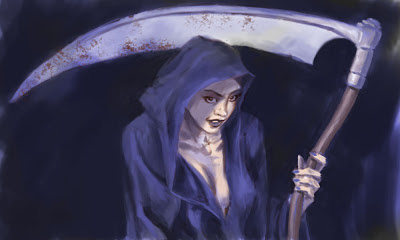
Well, I continue to play with Photoshop, and I think my skills are improving, to the point, gentle reader, that I am aboutto inflict a step-by-step on you...
This began as an unfocused doodle. At some point it implied the image of a skull, which morphed into, surprise, surprise, the personification of Death. But the tried and true left me a bit cool, so I thought, what if Death took an apprentice, a young woman, perhaps. Would she be angry, vengeful, goofy, mischievous, or just a little unsettling...?

My approach to painting in Ps has been a bit all over the map, so far. I've settled down a bit and decided to go with the grayscale-to-colour approach, really work on the value structure first, and then introduce colour. It worked for the Old Masters, and who am I to argue with long-lived success? I copied the drawing onto a new Multiply layer, so I could see through it, and began painting my values under it onto the Background layer.At this stage, I'm most concerned about simple blocks of only a few values. Mostly, I'm using a chalk brush, with Shape Dynamics off and Opacity set to Pen Pressure.

Following one of the great guiding principles, "work from the large, broad and general to the more refined and specific" I start to define the image a little more clearly. I refine the shape of the body and the hood of the cloak, and begin to paint the suggestions of volume, seperating the darks and lights. I've turned off the upper drawing layer now, so the bits of drawing you still see are from the original background image. Then I creat a new Overlay layer and wash in the first colour notes.

Now I have some base colour to work with, and I can continue to refine the shapes,volumes and edges. For the most part I will use the colour picker and adjust for saturation and value, in an attempt to keep the colour harmony intact. I don't actually introduce any new colour until I add the the rust (or perhaps dried bodily fluids) to blade of the scythe, with a textured brush.

A few more tweaks and fiddles and I think it's enough. It's still a long way from a finished illustration, but this was meant to be a learning exercise, and I think I've learned a lot. The face is still very much a coloured drawing as opposed to a painting, but I'll work on that in my next project.

Subscribe to:
Posts (Atom)